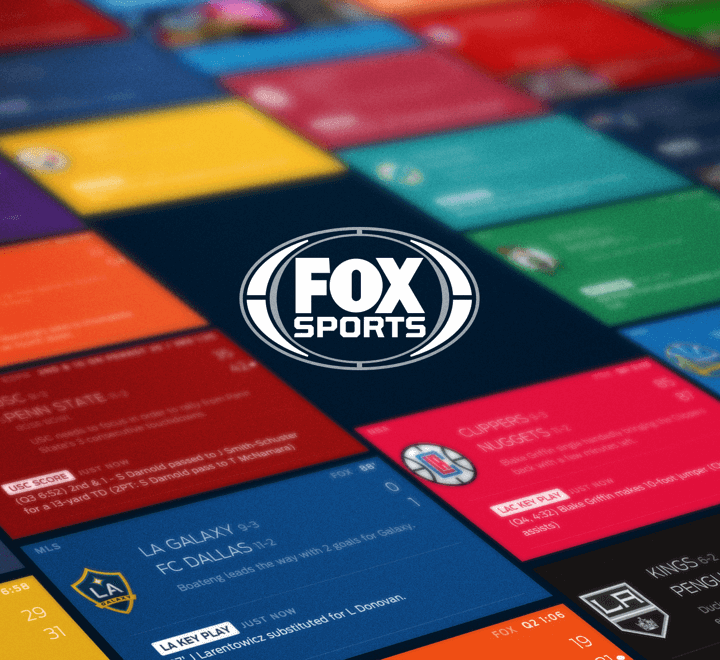
Fanhood was an exploration I did for an interactive and visually stimulating user profile. It was a way for users to define their fan identity and engage with personalized content across the entire Fox Sports digital ecosystem.
Fanhood was an exploration I did for an interactive and visually stimulating user profile. It was a way for users to define their fan identity and engage with personalized content across the entire Fox Sports digital ecosystem.
Fanhood was an exploration I did for an interactive and visually stimulating user profile. It was a way for users to define their fan identity and engage with personalized content across the entire Fox Sports digital ecosystem.
Fanhood was an exploration I did for an interactive and visually stimulating user profile. It was a way for users to define their fan identity and engage with personalized content across the entire Fox Sports digital ecosystem.
Fanhood was an exploration I did for an interactive and visually stimulating user profile. It was a way for users to define their fan identity and engage with personalized content across the entire Fox Sports digital ecosystem.
ROLE
UI/UX, Logo Design
UI/UX, Logo Design
YEARS
2015-2016
2015-2016
PLATFORMS I WORKED ON
iPhone, Android Phone
iPhone, Android Phone
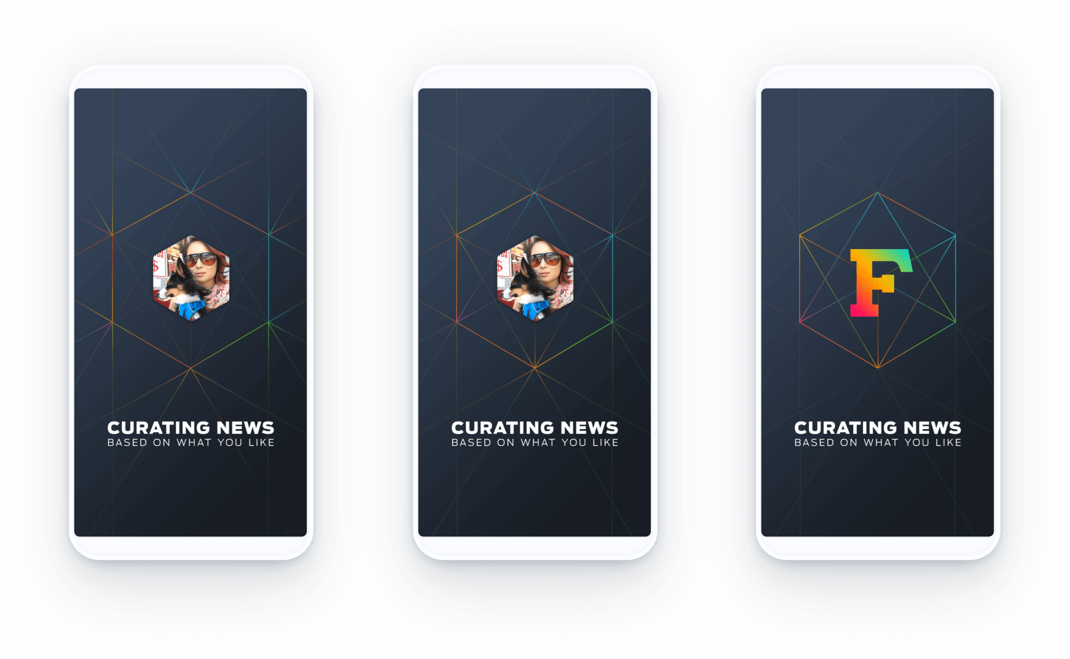
Your Fanhood DNA
Your Fanhood DNA
Before we settled on our current onboarding and profile designs, we experimented with multiple directions of your Fanhood "DNA." It wouldn't just show your favorite teams but rather paint a broader picture of who you are as a fan.
Before we settled on our current onboarding and profile designs, we experimented with multiple directions of your Fanhood "DNA." It wouldn't just show your favorite teams but rather paint a broader picture of who you are as a fan.
Before we settled on our current onboarding and profile designs, we experimented with multiple directions of your Fanhood "DNA." It wouldn't just show your favorite teams but rather paint a broader picture of who you are as a fan.
PROFILE
PROFILE
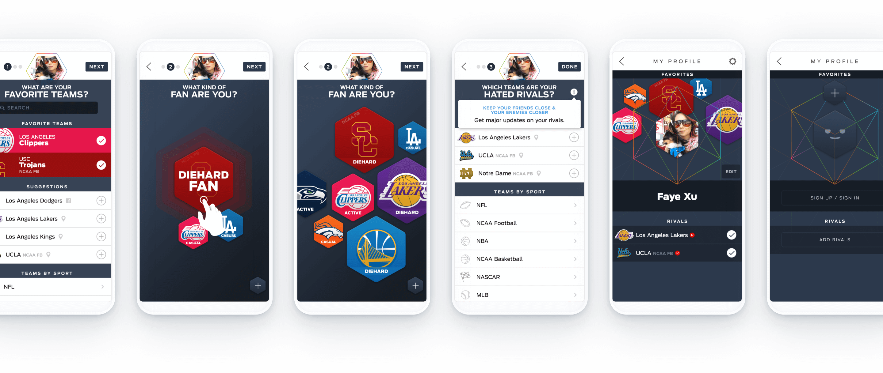
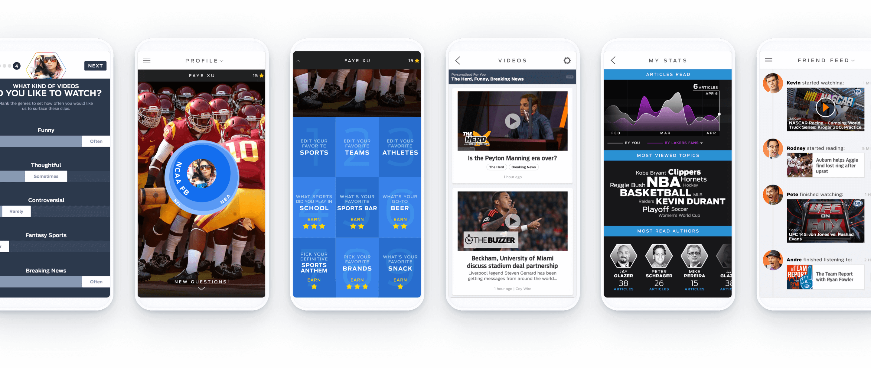
Users didn’t end up embracing the idea and found the onboarding process cumbersome and confusing. We kept some of the bold splashes of team color but redesigned the rest of the experience to be something more streamlined and easy to understand.
Users didn’t end up embracing the idea and found the onboarding process cumbersome and confusing. We kept some of the bold splashes of team color but redesigned the rest of the experience to be something more streamlined and easy to understand.
Logo explorations
Logo explorations
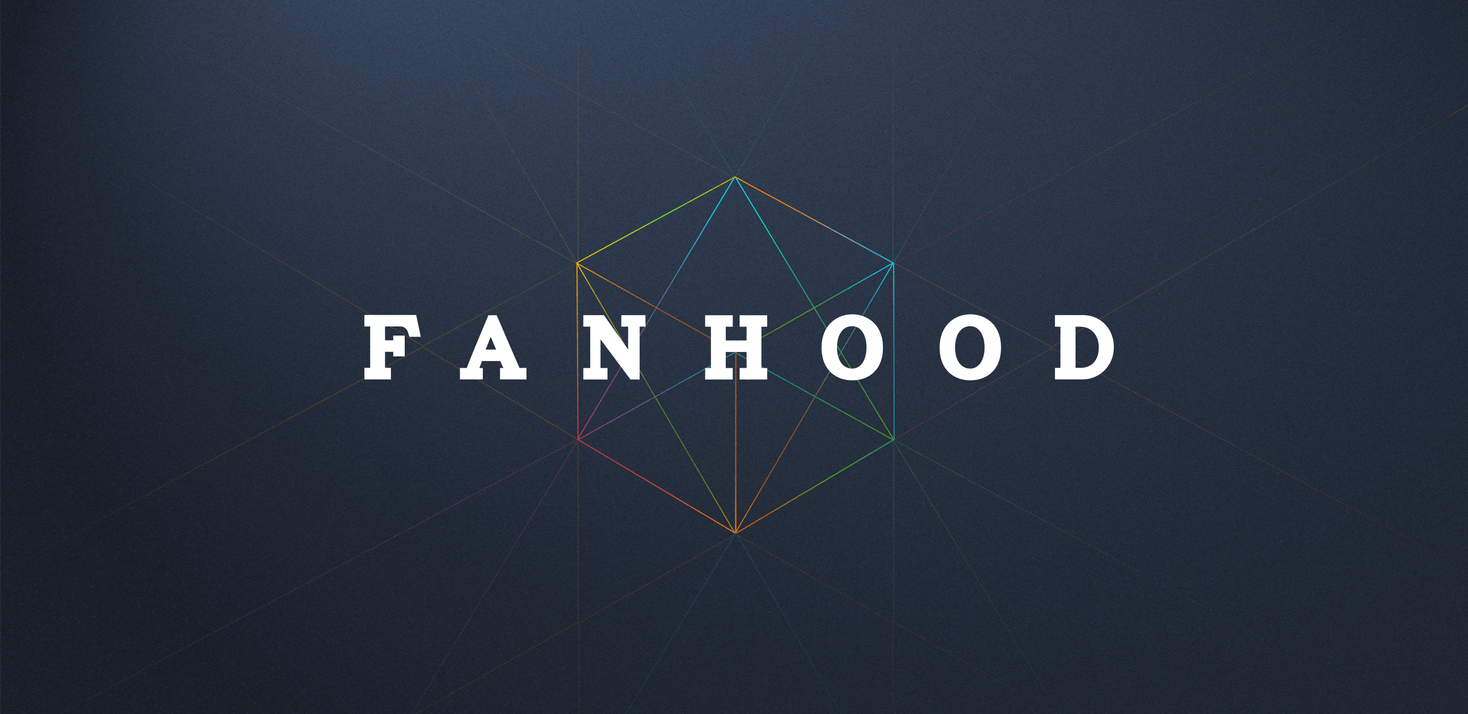
When exploring logo options, I had to create something that would be strong on its own, in a single letter form, and as a word, and used in conjunction with team names and/or team logos.
When exploring logo options, I had to create something that would be strong on its own, in a single letter form, and as a word, and used in conjunction with team names and/or team logos.

More Projects
Hi, I'm Faye Xu.
Product Designer at GoodRx
Reach out to me on LinkedIn or email me at feauxy@gmail.com.
Currently interested in a full-time UI/UX job in Los Angeles. Reach out to me on LinkedIn or email me at feauxy@gmail.com.

