The Fox Sports App is an all-encompassing sports app tailored to the fans. It’s packed with scores, key plays, stats, personalized live game headlines, the latest news, and live video content. In 2018 it was featured on the Communication Arts Interactive Competition Shortlist.
The Fox Sports App is an all-encompassing sports app tailored to the fans. It’s packed with scores, key plays, stats, personalized live game headlines, the latest news, and live video content. In 2018 it was featured on the Communication Arts Interactive Competition Shortlist.
The Fox Sports App is an all-encompassing sports app tailored to the fans. It’s packed with scores, key plays, stats, personalized live game headlines, the latest news, and live video content. In 2018 it was featured on the Communication Arts Interactive Competition Shortlist.
The Fox Sports App is an all-encompassing sports app tailored to the fans. It’s packed with scores, key plays, stats, personalized live game headlines, the latest news, and live video content. In 2018 it was featured on the Communication Arts Interactive Competition Shortlist.
The Fox Sports App is an all-encompassing sports app tailored to the fans. It’s packed with scores, key plays, stats, personalized live game headlines, the latest news, and live video content. In 2018 it was featured on the Communication Arts Interactive Competition Shortlist.
ROLE
UI/UX, Art Direction
UI/UX, Art Direction
YEARS
2013-2019
2013-2019
PLATFORMS I WORKED ON
iOS, Android
iOS, Android
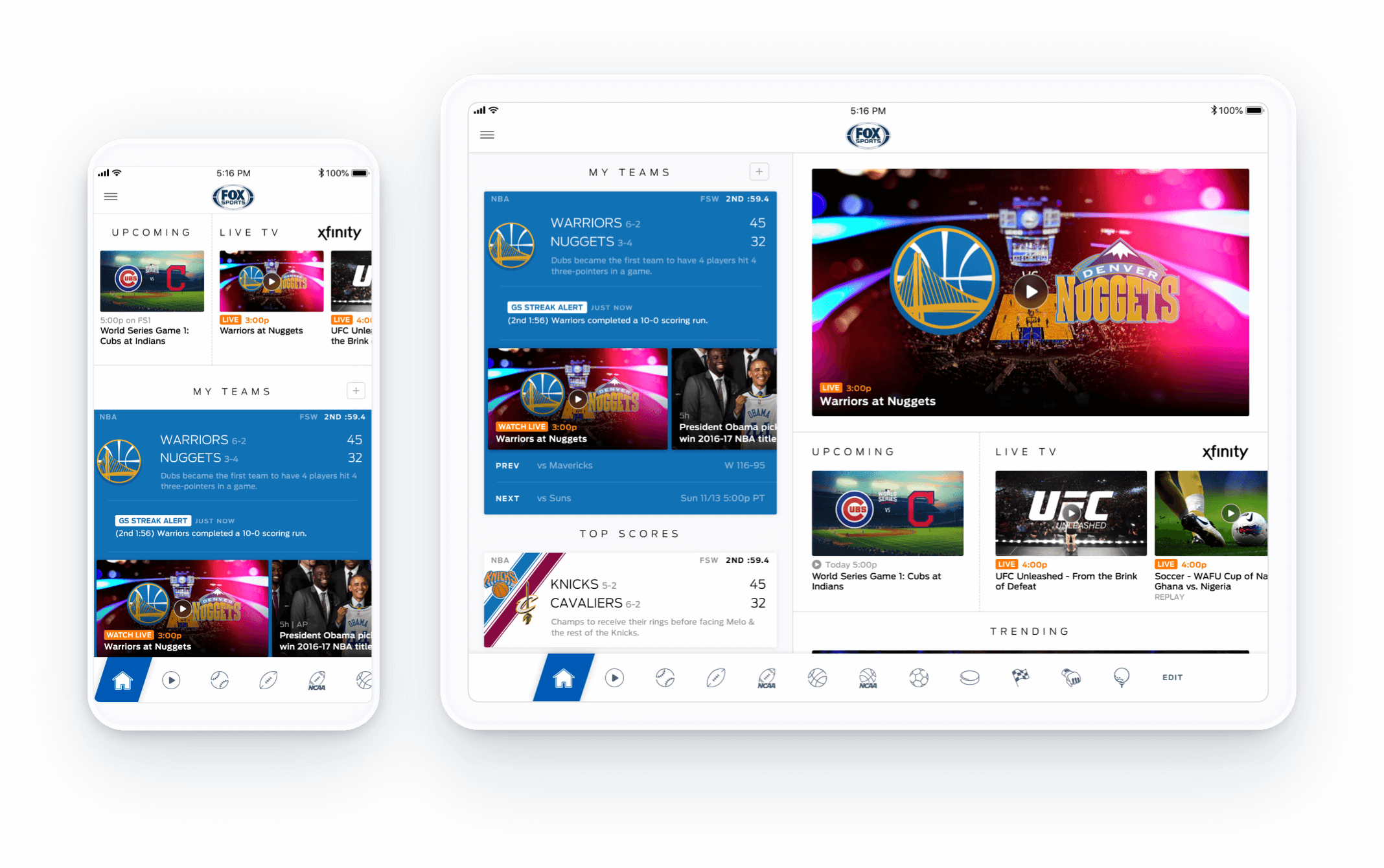
I collaborated with Jeff Soo (Senior UX Designer '13-'15), Alexis Lopez (Senior UX Designer '16-'19), and Jon Dean (SVP of UX & Design) on the following designs.
I collaborated with Jeff Soo (Senior UX Designer '13-'15), Alexis Lopez (Senior UX Designer '16-'19), and Jon Dean (SVP of UX & Design) on the following designs.
I collaborated with Jeff Soo (Senior UX Designer '13-'15), Alexis Lopez (Senior UX Designer '16-'19), and Jon Dean (SVP of UX & Design) on the following designs.
Not just another sports app
Not just another sports app
With so many sports apps already in existence, the challenge we faced was how to stand out. We found out that fans have two general dissatisfactions when using other sports apps–that apps didn't do much with the favorited teams information, and that they had to dig too deep to get what they wanted. We set out to design with the fans in mind, offering a level of personalization that was not only useful but also accessible.
With so many sports apps already in existence, the challenge we faced was how to stand out. We found out that fans have two general dissatisfactions when using other sports apps–that apps didn't do much with the favorited teams information, and that they had to dig too deep to get what they wanted. We set out to design with the fans in mind, offering a level of personalization that was not only useful but also accessible.
With so many sports apps already in existence, the challenge we faced was how to stand out. We found out that fans have two general dissatisfactions when using other sports apps–that apps didn't do much with the favorited teams information, and that they had to dig too deep to get what they wanted. We set out to design with the fans in mind, offering a level of personalization that was not only useful but also accessible.
With so many sports apps already in existence, the challenge we faced was how to stand out. We found out that fans have two general dissatisfactions when using other sports apps–that apps didn't do much with the favorited teams information, and that they had to dig too deep to get what they wanted. We set out to design with the fans in mind, offering a level of personalization that was not only useful but also accessible.
GAME CHIPS
GAME CHIPS
Favorited Team Chips
Favorited Team Chips
Favorited Team Chips
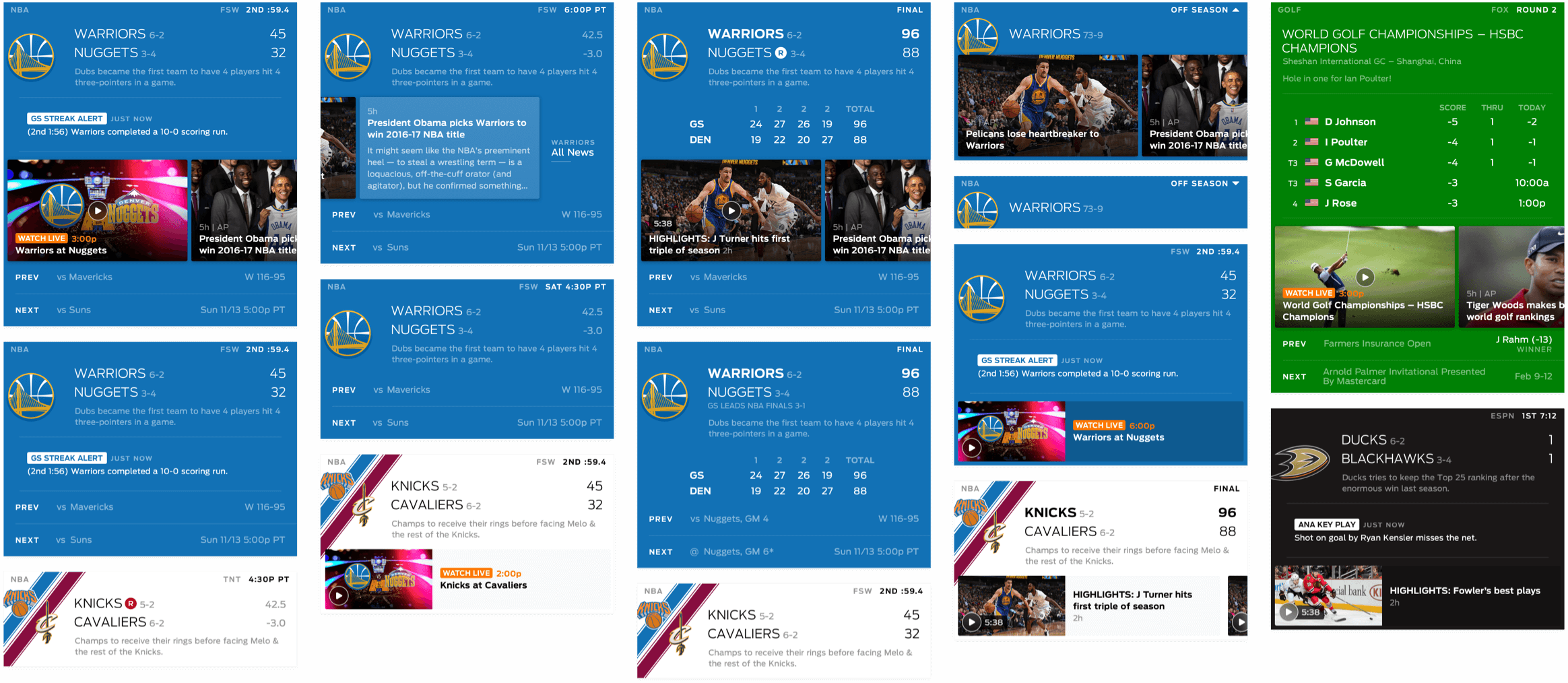
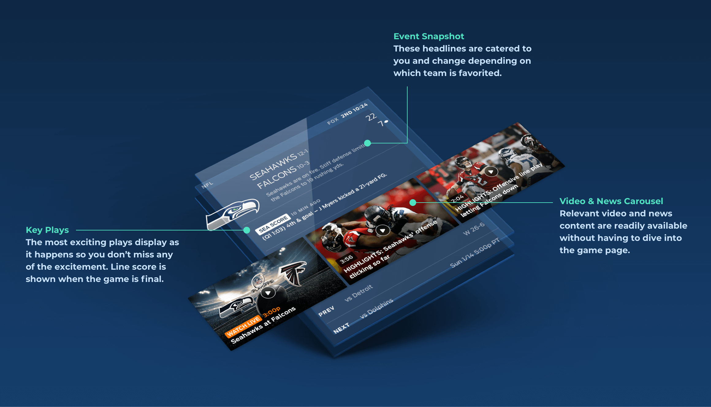
Since Fox Sports App is first and foremost about favorited teams, it was important to have them stand out. The chips were designed with a total team color takeover and an enlarged team logo. Logos were positioned 10px off-canvas so they could appear larger and more prominent. Favorited team chips display additional info such as schedule, line score, and key plays so you can get a quick summary at a glance without having to dive into a game page.
Since Fox Sports App is first and foremost about favorited teams, it was important to have them stand out. The chips were designed with a total team color takeover and an enlarged team logo. Logos were positioned 10px off-canvas so they could appear larger and more prominent. Favorited team chips display additional info such as schedule, line score, and key plays so you can get a quick summary at a glance without having to dive into a game page.
Since Fox Sports App is first and foremost about favorited teams, it was important to have them stand out. The chips were designed with a total team color takeover and an enlarged team logo. Logos were positioned 10px off-canvas so they could appear larger and more prominent. Favorited team chips display additional info such as schedule, line score, and key plays so you can get a quick summary at a glance without having to dive into a game page.
Non-Favorited Team Chips
Non-Favorited Team Chips
Non-Favorited Team Chips
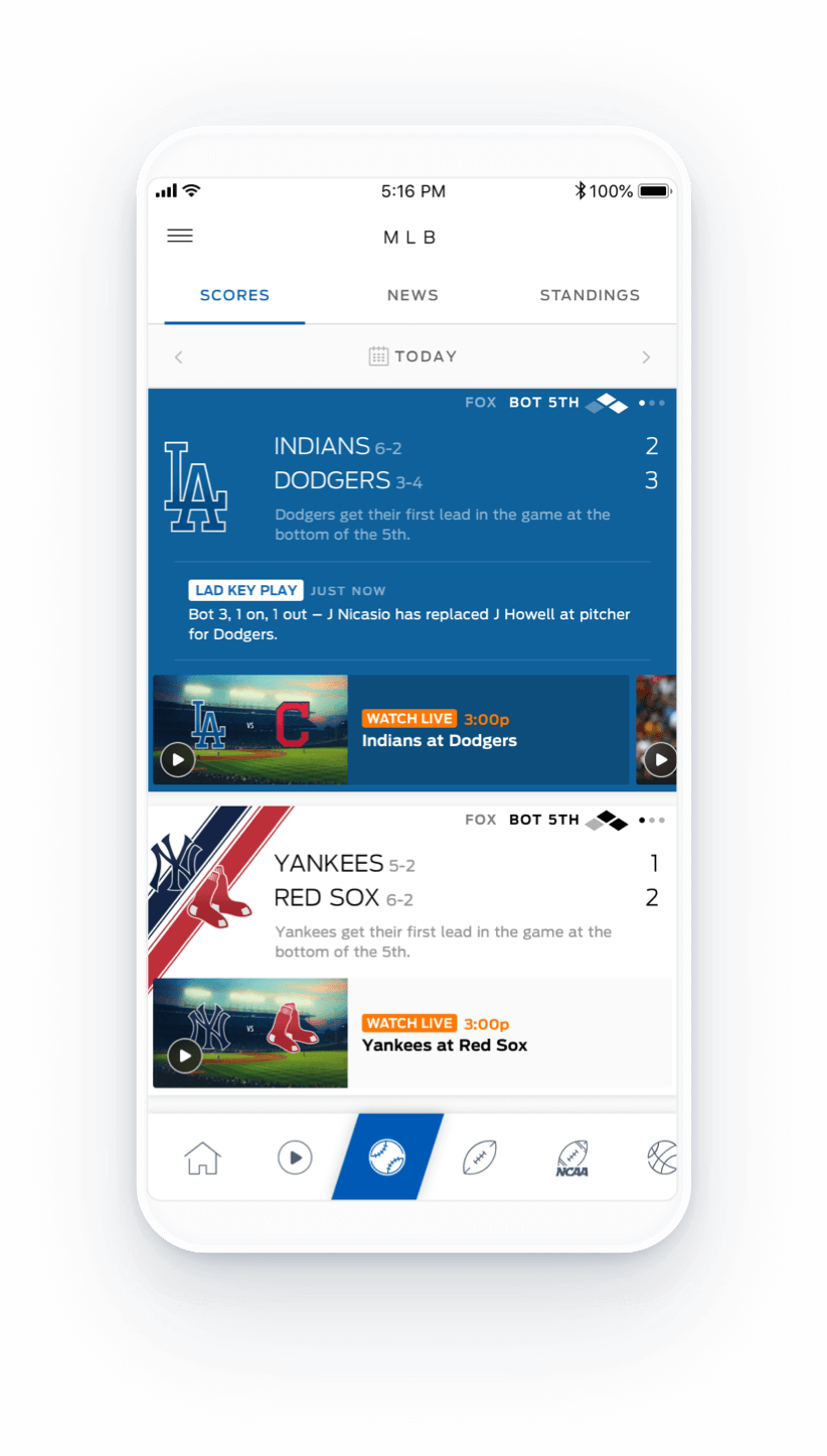
For non-favorited teams, we still wanted a splash of color and a noticeable logo. While we didn’t want it to compete with the favorited team chips, we also didn’t want it to get lost beneath the solid color blocks. This balance was achieved by using diagonal stripes of color, which also provided housing for the logo. By having staggered logos, we were able to size them up without having to increase vertical padding between the team names.
For non-favorited teams, we still wanted a splash of color and a noticeable logo. While we didn’t want it to compete with the favorited teams chips, we also didn’t want it to get lost beneath the solid color blocks. This balance was achieved by using diagonal stripes of color, which also provided housing for the logo. By having staggered logos, we were able to size them up without having to increase vertical padding between the team names.
For non-favorited teams, we still wanted a splash of color and a noticeable logo. While we didn’t want it to compete with the favorited team chips, we also didn’t want it to get lost beneath the solid color blocks. This balance was achieved by using diagonal stripes of color, which also provided housing for the logo. By having staggered logos, we were able to size them up without having to increase vertical padding between the team names.
For non-favorited teams, we still wanted a splash of color and a noticeable logo. While we didn’t want it to compete with the favorited team chips, we also didn’t want it to get lost beneath the solid color blocks. This balance was achieved by using diagonal stripes of color, which also provided housing for the logo. By having staggered logos, we were able to size them up without having to increase vertical padding between the team names.
Rivals
Rivals
Rivals
In addition to following favorited teams, we also included the ability to follow rivals. As much as fans love to see their teams win, they also love to see their enemies fail. Rival teams are designated with a red circle R icon and also have priority placement in the chip feed.
In addition to following favorited teams, we also included the ability to follow rivals. As much as fans love to see their teams win, they also love to see their enemies fail. Rival teams are designated with a red circle R icon and also have priority placement in the chip feed.
In addition to following favorited teams, we also included the ability to follow rivals. As much as fans love to see their teams win, they also love to see their enemies fail. Rival teams are designated with a red circle R icon and also have priority placement in the chip feed.
In addition to following favorited teams, we also included the ability to follow rivals. As much as fans love to see their teams win, they also love to see their enemies fail. Rival teams are designated with a red circle R icon and also have priority placement in the chip feed.
ONBOARDING & NAV
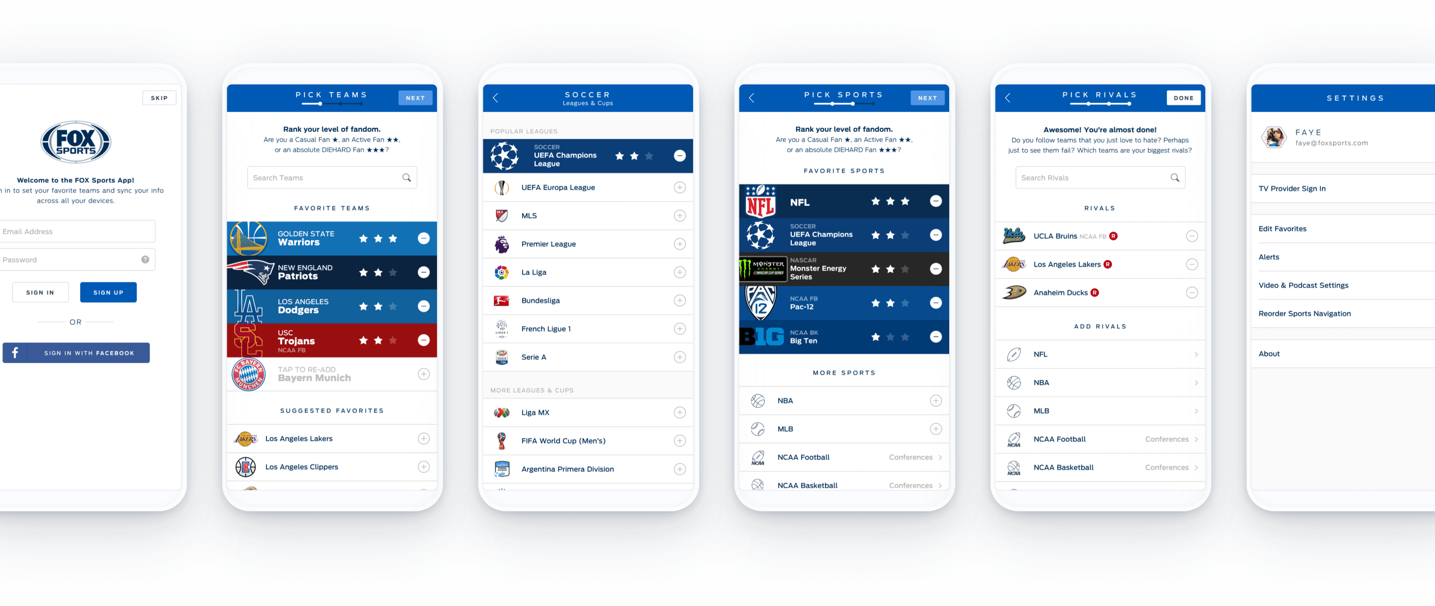
Our goal was to make onboarding easy and versatile—highly customizable for those that wanted a truly personalized experience, and skippable for those that didn’t. Fans are able to not only select favorite teams, but also favorite sports, leagues, and conferences. Each selection is defaulted to two stars (Active Fan) but can be easily changed to one star (Casual Fan) or three stars (Diehard Fan).
Our goal was to make onboarding easy and versatile—highly customizable for those that wanted a truly personalized experience, and skippable for those that didn’t. Fans are able to not only select favorite teams, but also favorite sports, leagues, and conferences. Each selection is defaulted to two stars (Active Fan) but can be easily changed to one star (Casual Fan) or three stars (Diehard Fan).
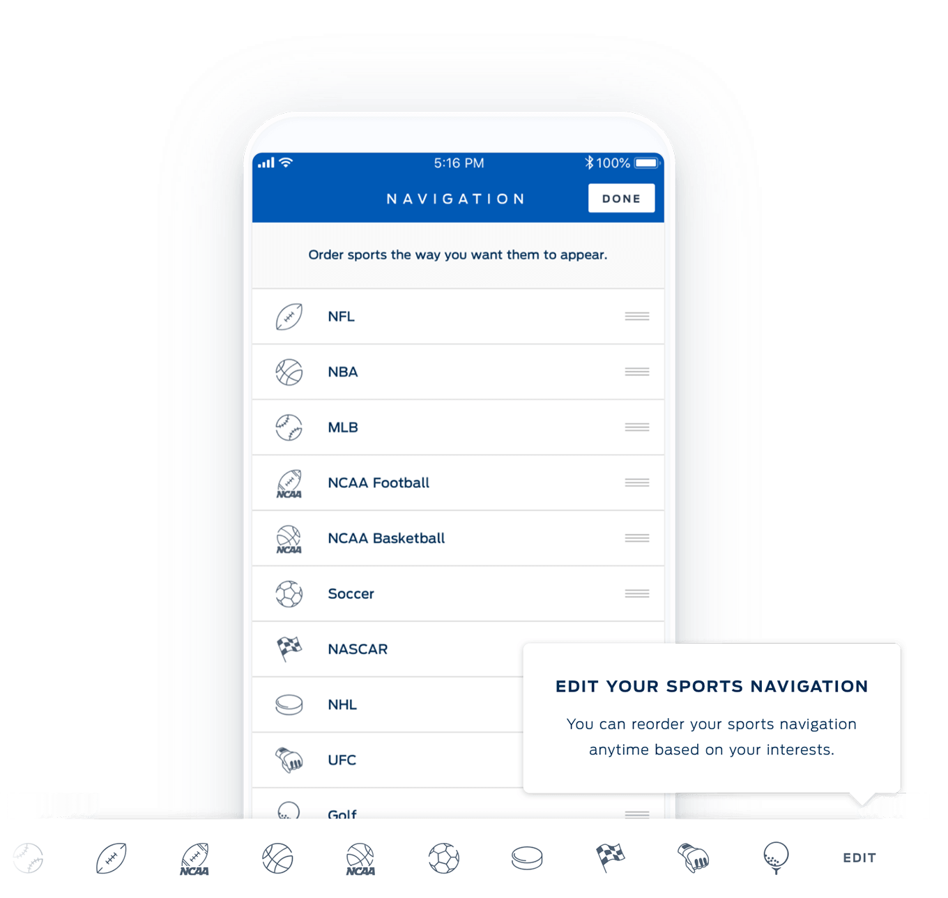
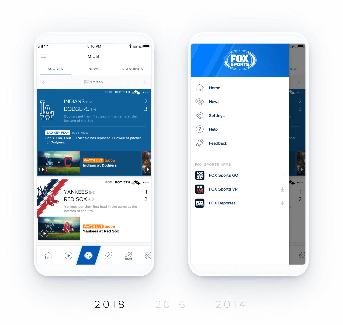
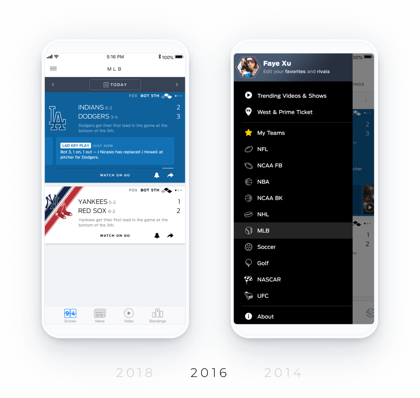
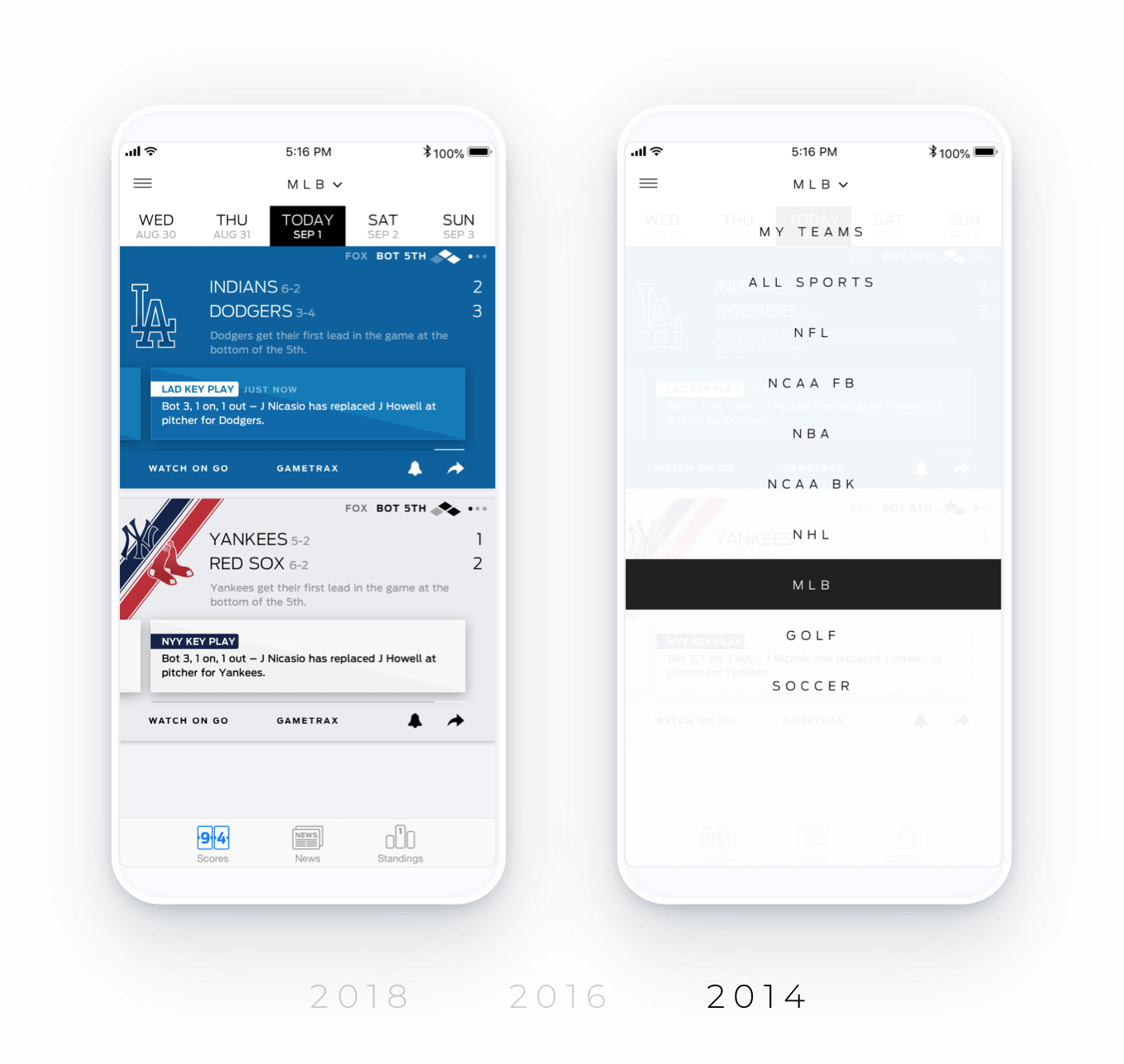
For the third iteration of our app, we decided to rework the main navigation to place more focus on the sports. Previous versions had a more buried sports selector, which was the trend amongst other popular sports apps. We redesigned it so that:
- The sports were front and center in the bottom nav. A sub-navigation was available for toggling between Scores, News, and Standings once a sport was selected.
- Users were allowed to reorganize the sports so that the ones they are interested in are just one tap away. The sports they didn't care about would stay hidden.
For the third iteration of our app, we decided to rework the main navigation to place more focus on the sports. Previous versions had a more buried sports selector, which was the trend amongst other popular sports apps. We redesigned it so that:
- The sports were front and center in the bottom nav. A sub-navigation was available for toggling between Scores, News, and Standings once a sport was selected.
- Users were allowed to reorganize the sports so that the ones they are interested in are just one tap away. The sports they didn't care would stay hidden.
For the third iteration of our app, we decided to rework the main navigation to place more focus on the sports. Previous versions had a more buried sports selector, which was the trend amongst other popular sports apps. We redesigned it so that:
- The sports were front and center in the bottom nav. A sub-navigation was available for toggling between Scores, News, and Standings once a sport was selected.
- Users were allowed to reorganize the sports so that the ones they are interested in are just one tap away. The sports they didn't care about would stay hidden.
This version had an overwhelmingly positive response during user tests.
This version had an overwhelmingly positive response during user tests.
HOME PAGE
Your home page is where you can get a summary of what’s going on with your teams as well as check out other top videos and games. Game chips are taller and include the previous and next games. Video carousel chips are larger and taller than their default size to provide a better swiping experience.
Your home page is where you can get a summary of what’s going on with your teams as well as check out other top videos and games. Game chips are taller and include the previous and next games. Video carousel chips are larger and taller than their default size to provide a better swiping experience.
Your home page is where you can get a summary of what’s going on with your teams as well as check out other top videos and games. Game chips are taller and include the previous and next games. Video carousel chips are larger and taller than their default size to provide a better swiping experience.
SPORT PAGE
SPORT PAGE
Scores
Scores
The game chips here use a wider, shorter video chip. The primary purpose on this page is to see various game scores. By shortening the game chip height, you are able to see more games at once.
The game chips here use a wider, shorter video chip. The primary purpose on this page is to see various game scores. By shortening the game chip height, you are able to see more games at once.
News
News
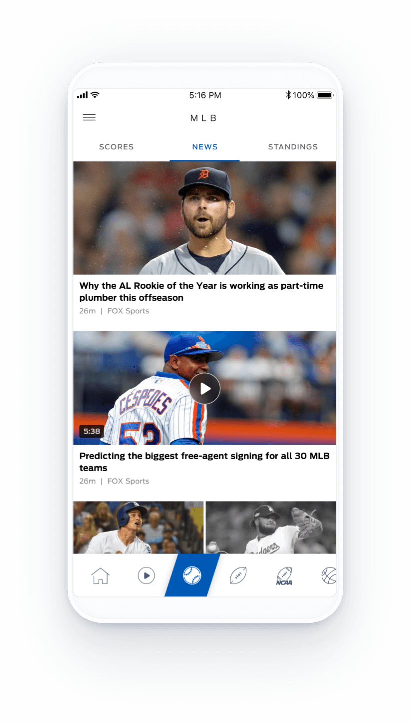
News and videos are sized according to what’s trending. Videos autoplay in the thumbnail and dim to black and white once it’s been viewed.
News and videos are sized according to what’s trending. Videos autoplay in the thumbnail and dim to black and white once it’s been viewed.
Standings
Standings
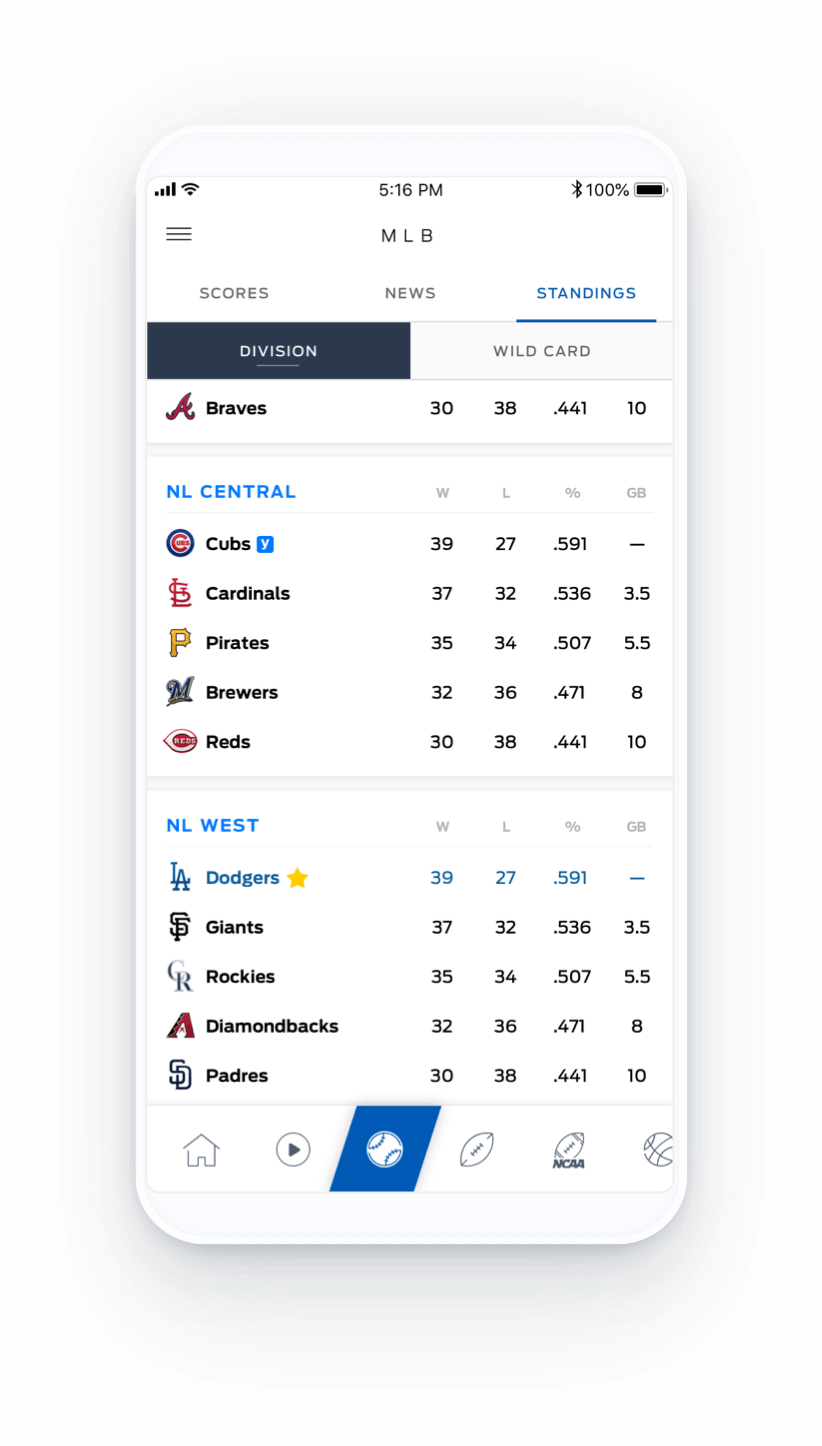
Favorited teams are called out in Standings so they’re easy to spot when scrolling down the page.
Favorited teams are called out in Standings so they’re easy to spot when scrolling down the page.
GAME PAGE
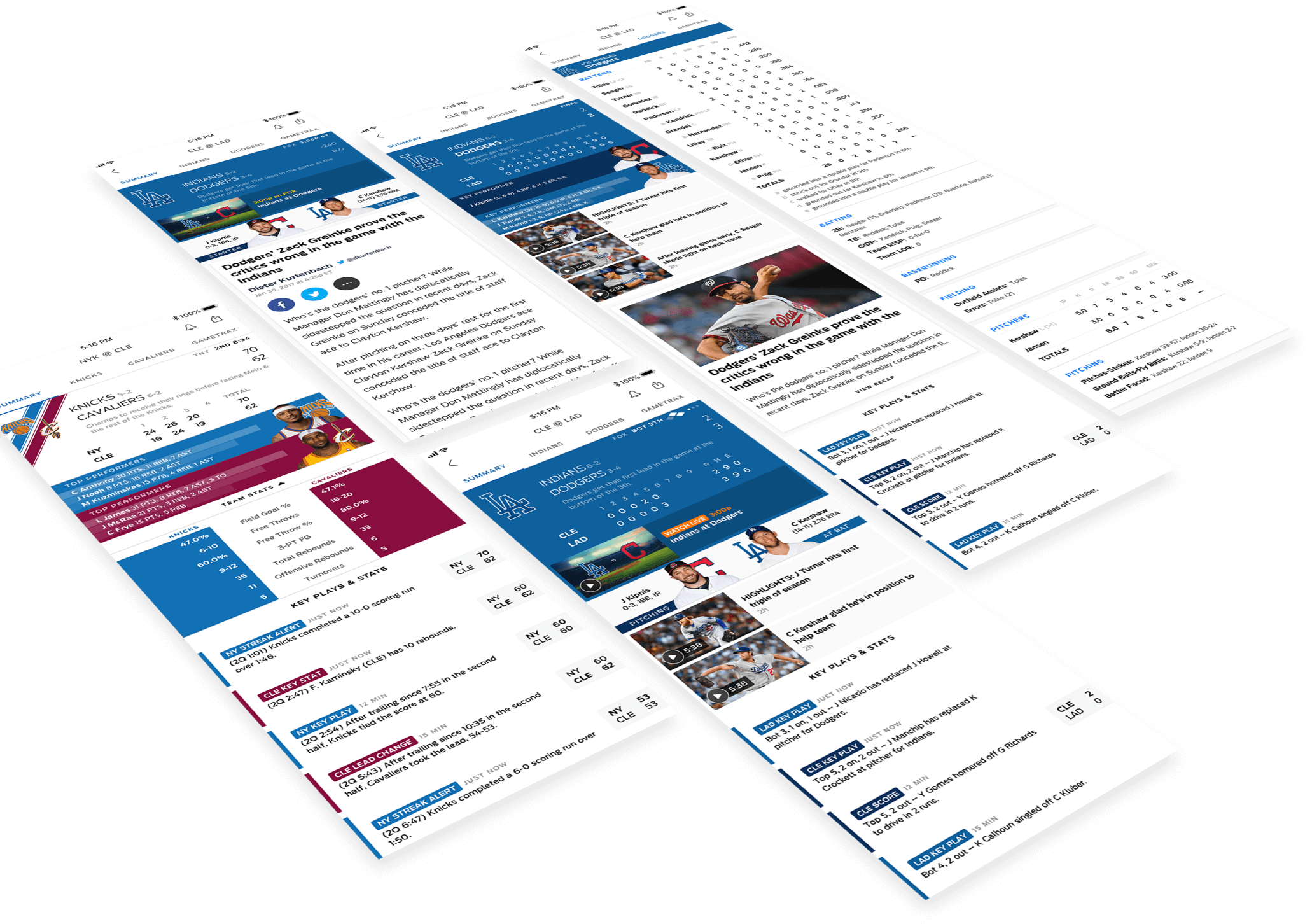
The bold chip design carries over to the game page to ensure you are always surrounded by your team identity wherever you go in the app. Each section is stackable and can be adapted to work with other sports.
The bold chip design carries over to the game page to ensure you are always surrounded by your team identity wherever you go in the app. Each section is stackable and can be adapted to work with other sports.
Bringing video to the forefront
Bringing video to the forefront
In the early years due to technical constraints, our content was designed to be separated into two apps—videos in Fox Sports Go and scores, news, and stats in the Fox Sports App. As shown in the mockups above, we’ve gradually started to integrate video—first as a scrollable section at the top of Home, then contextually into the game chips. Our next goal was to bring in Replays, Highlights, Shows, and Podcasts so we could eventually retire Fox Sports Go.
In the early years due to technical constraints, our content was designed to be separated into two apps—videos in Fox Sports Go and scores, news, and stats in the Fox Sports App. As shown in the mockups above, we’ve gradually started to integrate video—first as a scrollable section at the top of Home, then contextually into the game chips. Our next goal was to bring in Replays, Highlights, Shows, and Podcasts so we could eventually retire Fox Sports Go.
WATCH & LISTEN
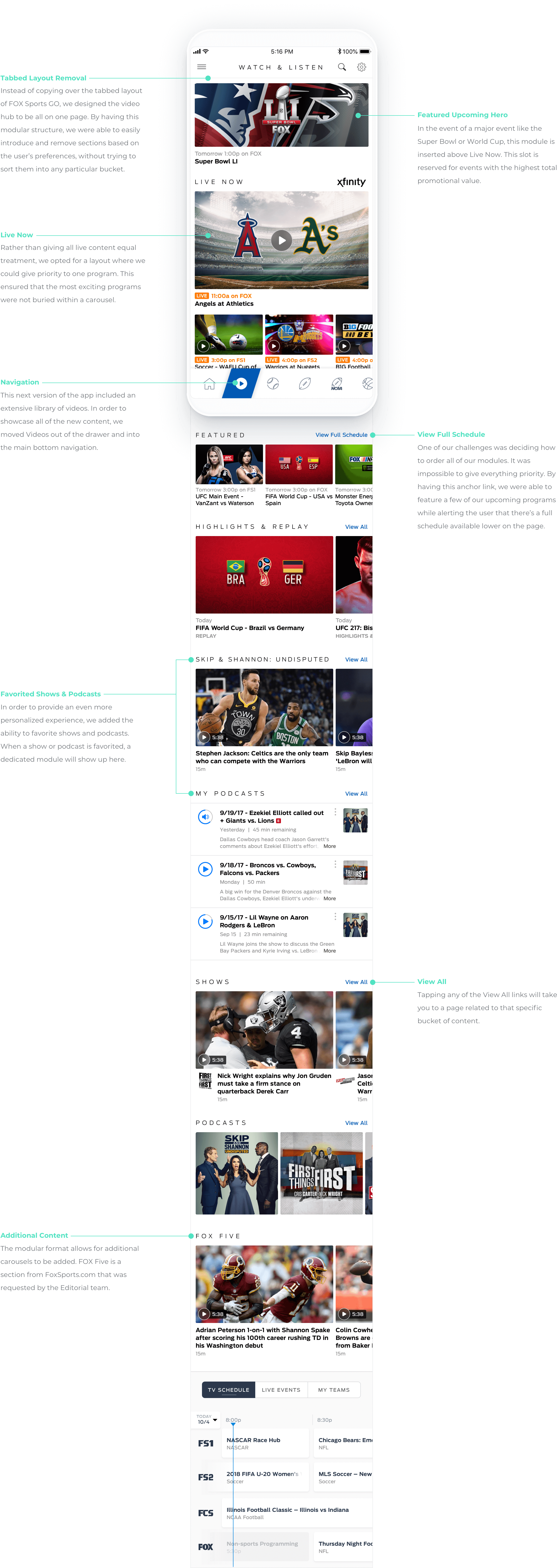
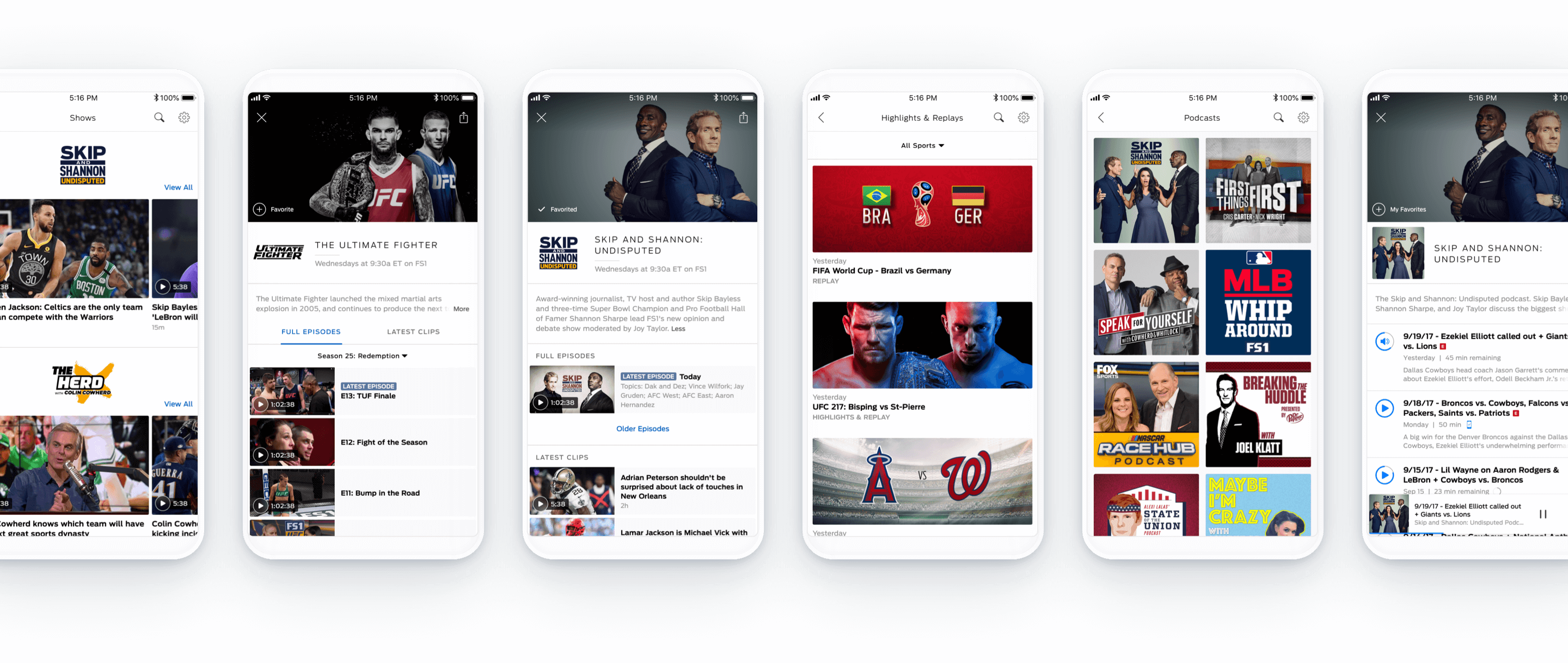
From the Watch & Listen hub, you can dig deeper into three main areas: Shows, Highlights & Replays, and Podcasts. From there, you can access a comprehensive library of video and audio content. Relevant clips, episodes, and events are surfaced. Search and filter functionalities are also available to help you easily find what you're looking for.
From the Watch & Listen hub, you can dig deeper into three main areas: Shows, Highlights & Replays, and Podcasts. From there, you can access a comprehensive library of video and audio content. Relevant clips, episodes, and events are surfaced. Search and filter functionalities are also available to help you easily find what you're looking for.
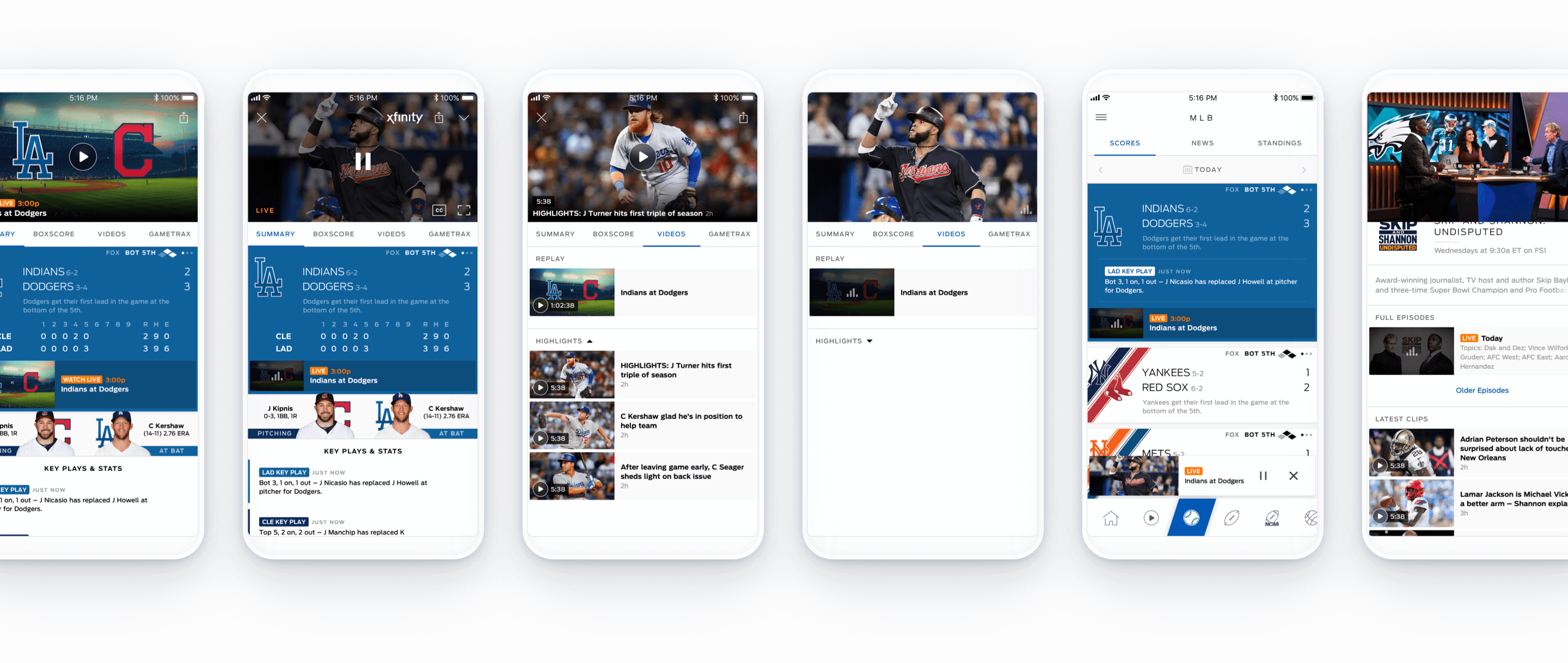
We revisited the rest of the app and make some structural changes that would allow for the seamless integration of the new Portrait Player. Event pages were modified to be modals instead of nested pages to accommodate for the dismissal of a page via the mini-player. A Videos section was added to allow for a no-spoilers mode when users are coming to the event page to watch a replay of a specific game.
We revisited the rest of the app and make some structural changes that would allow for the seamless integration of the new Portrait Player. Event pages were modified to be modals instead of nested pages to accommodate for the dismissal of a page via the mini-player. A Videos section was added to allow for a no-spoilers mode when users are coming to the event page to watch a replay of a specific game.
Adaptablity and scalability
Adaptability and scalability
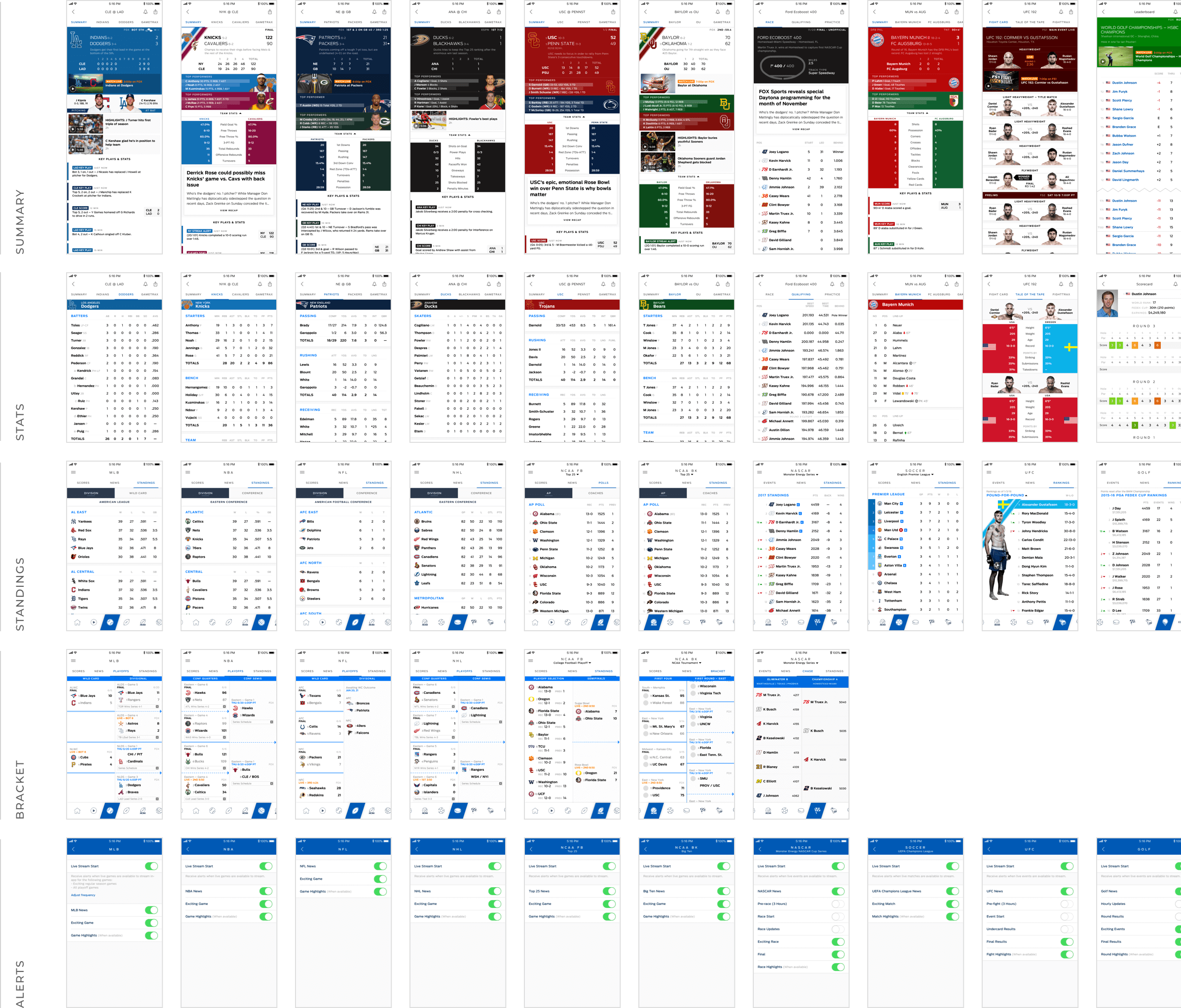
When designing for something as in-depth as the FOX Sports App, it was important to consider templates and guidelines. Even though each sport is very distinct, there are elements that can be repurposed to make the experience more cohesive for the users and the development easier for the engineering team.
When designing for something as in-depth as the FOX Sports App, it was important to consider templates and guidelines. Even though each sport is very distinct, there are elements that can be repurposed to make the experience more cohesive for the users and the development easier for the engineering team.
When designing for something as in-depth as the FOX Sports App, it was important to consider templates and guidelines. Even though each sport is very distinct, there are elements that can be repurposed to make the experience more cohesive for the users and the development easier for the engineering team.
SPORT PERMUTATIONS
VIDEO CHIPS

In addition to the 250+ app screens I mocked up to show every permutation of every sport, I also put together this video chip document to showcase how all the various formats should be used across the app in different scenarios. It was important to have this point of reference in order to maintain consistency when designing future screens.
In addition to the 250+ app screens I mocked up to show every permutation of every sport, I also put together this video chip document to showcase how all the various formats should be used across the app in different scenarios. It was important to have this point of reference in order to maintain consistency when designing future screens.
Designing for iPad
Designing for iPad
Our challenge here was to provide an immersive experience while keeping development effort minimal. How do we fully utilize the extra space while trying to keep as many as possible of the components the same?
Our challenge here was to provide an immersive experience while keeping development effort minimal. How do we fully utilize the extra space while trying to keep as many as possible of the components the same?
HOME PAGE
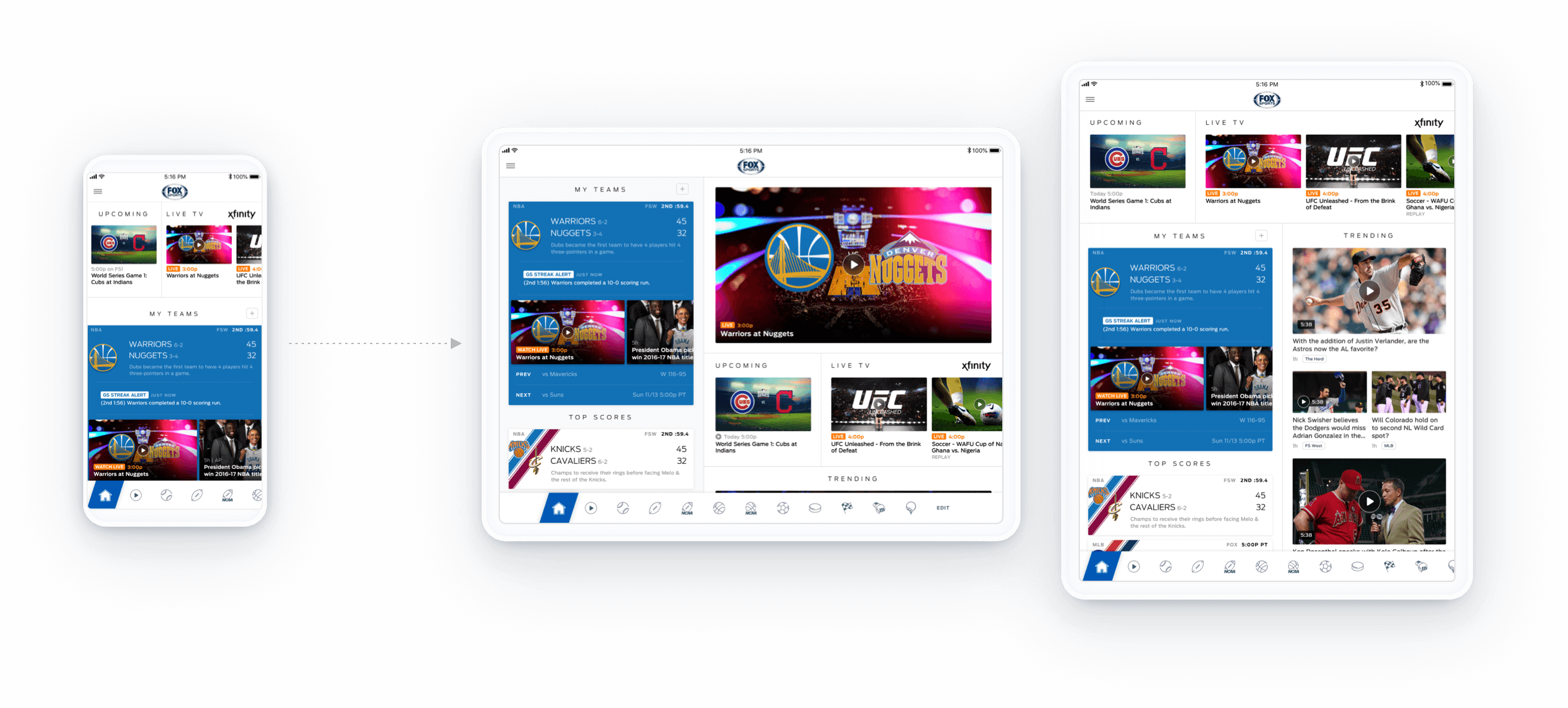
Most of the modules on the Home Page stayed the same, but by adding an extra column we were able to place Trending above the fold. On landscape tablet view we were also able to include a featured video section. This section is removed If there isn’t a video with a total promotional value that’s above the featured threshold.
Most of the modules on the Home Page stayed the same, but by adding an extra column we were able to place Trending above the fold. On landscape tablet view we were also able to include a featured video section. This section is removed If there isn’t a video with a total promotional value that’s above the featured threshold.
SPORT PAGE
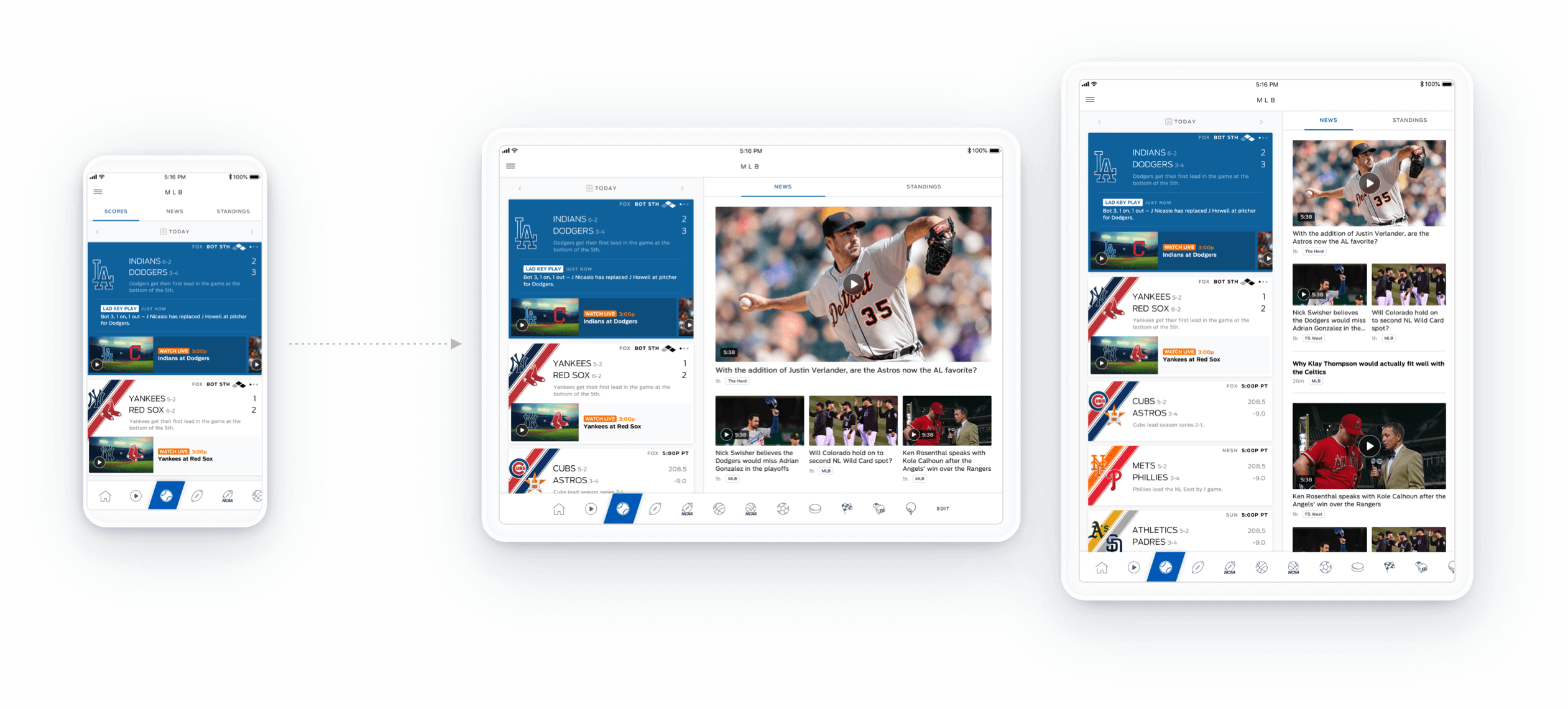
The Sport Page uses the same layout as the Home Page. Since Scores and News are what most users are looking for, we designed it so that you can see all of that content at a glance. Standings are a bit more buried but still quickly accessible. Columns scroll independently so you can keep an eye on a game while browsing through News or Standings.
The Sport Page uses the same layout as the Home Page. Since Scores and News are what most users are looking for, we designed it so that you can see all of that content at a glance. Standings are a bit more buried but still quickly accessible. Columns scroll independently so you can keep an eye on a game while browsing through News or Standings.
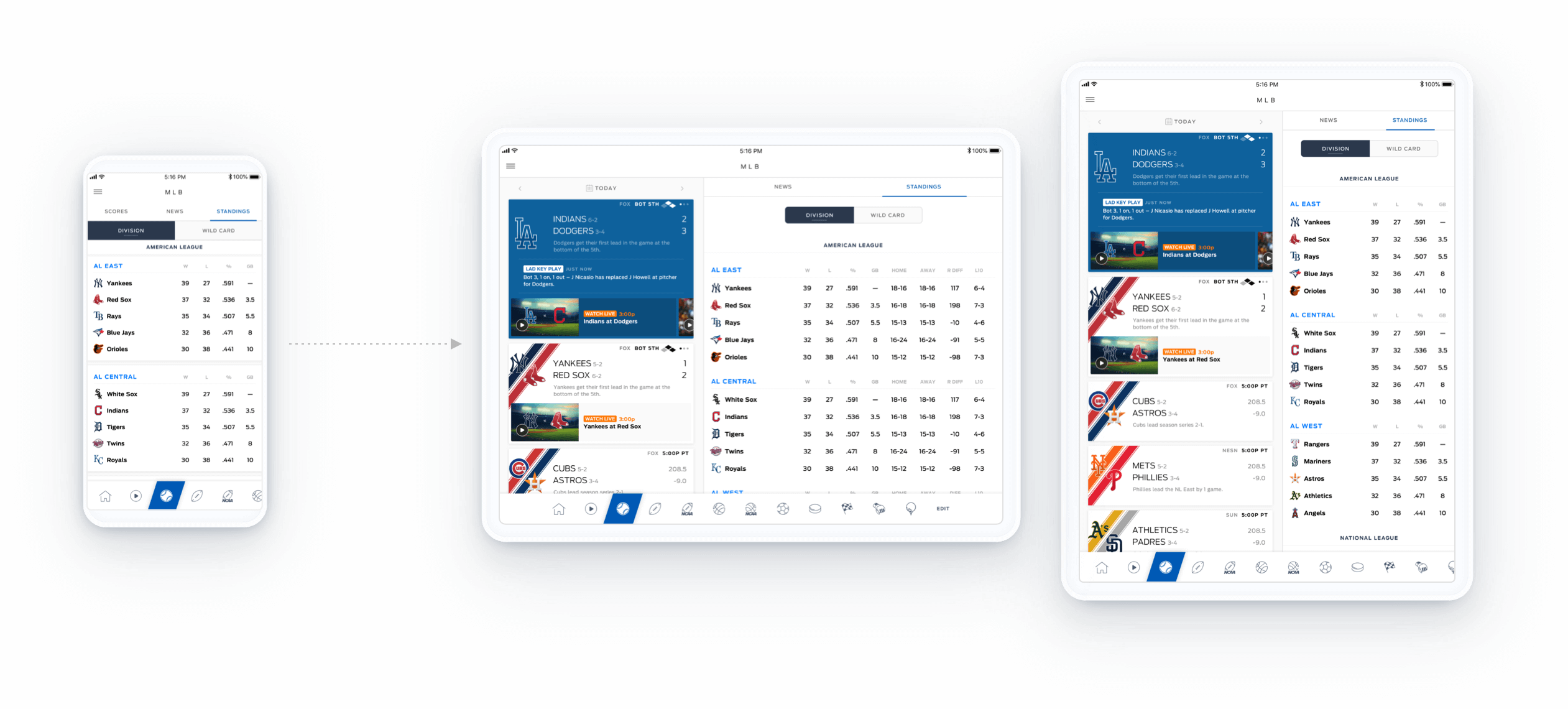
We used the extra space in landscape mode to display additional columns of stats in Standings.
We used the extra space in landscape mode to display additional columns of stats in Standings.
GAME PAGE
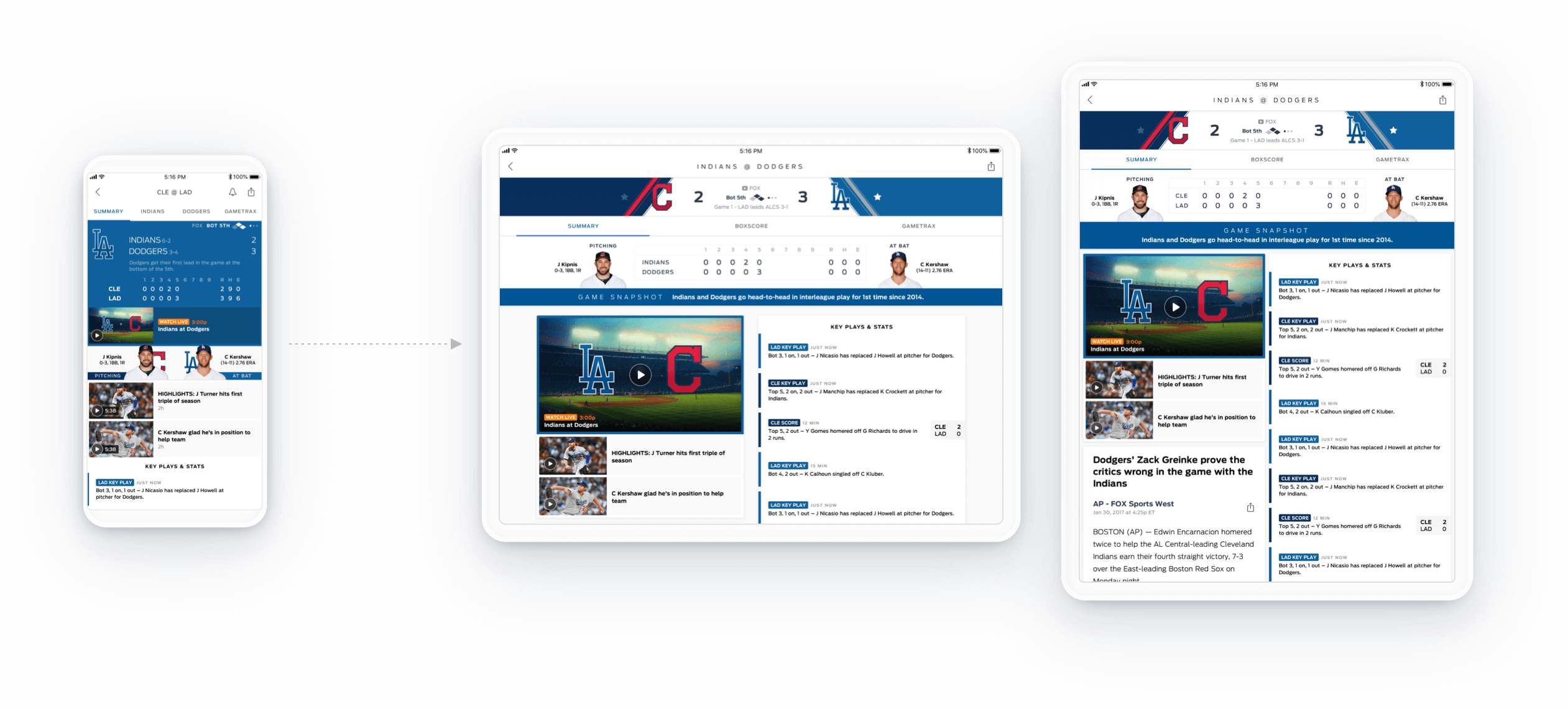
We redesigned the Game Page to include prominent team colors and logos from both teams. If a team if favorited, the Game Snapshot bar will reflect that team’s color. The head-to-head format makes better usage of the space and allows for the user to easily favorite a team by tapping on the star icon.
We redesigned the Game Page to include prominent team colors and logos from both teams. If a team if favorited, the Game Snapshot bar will reflect that team’s color. The head-to-head format makes better usage of the space and allows for the user to easily favorite a team by tapping on the star icon.
More Projects
Hi, I'm Faye Xu.
Product Designer at GoodRx
Reach out to me on LinkedIn or email me at feauxy@gmail.com.
Currently interested in a full-time UI/UX job in Los Angeles. Reach out to me on LinkedIn or email me at feauxy@gmail.com.

